
What Does Your Brand Colour Say About You?
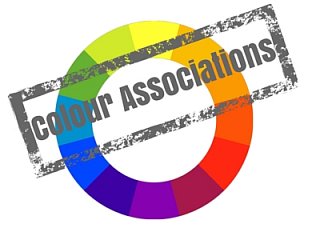
Did you know that the colours you choose for your brand and marketing literature can say a lot about you as a company?
Colours are said to have associated meanings, here are a few examples of what colours can mean and how to apply them to your marketing.
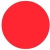 The colour of fire, associated with energy, war, danger, strength, power, determination as well as desire. Red is a very emotionally intense colour. It has very high visibility, which is why stop signs, stoplights, and fire equipment are usually painted red. Often used to bring text and images to the foreground. Used as an accent colour to stimulate people to make quick decisions; it is a perfect colour for 'Buy Now' and is commonly used for price promotions.
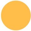 Combines the energy of red and the happiness of yellow. It is associated with joy and sunshine. Orange represents enthusiasm, fascination, happiness, creativity, determination and success. Orange is seem to be a hot colour, giving the sensation of heat whilst not being as aggressive as red. this colour is said to be highly accepted among young people. Orange has very high visibility, so you can use it to catch attention and highlight the most important elements of your design. Orange is very effective for promoting food products and toys.
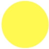 The colour of sunshine. Yellow is associated with joy, happiness, intellect, energy it is said to indicates honour and loyalty. This colour creates feeling of warmth ans cheerfulness. When overused, yellow may have a negative effect (studies have shown that babies cry more in yellow rooms). Yellow is seen before other colours when placed against black; this combination is often used to issue a warning.Yellow is very effective for attracting attention, so use it to highlight the most important elements of your design.
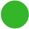 The colour of nature. It symbolizes growth, hope, harmony and freshness. Green has strong a strong correlation with safety and suggests stability and endurance. Whereas dark green is commonly associated with money. Green is said the have great healing powers, it is the most restful colour for the human eye. Use green to indicate safety in advertising. It is directly related to nature, so you can use it to promote 'green' products.
 Blue is the colour of the sky and sea. It is often associated with depth and stability. It symbolizes trust, loyalty, wisdom, confidence, intelligence, faith and truth. Blue is considered create a calming effect. It is linked to consciousness and intellect and is said to suggest precision. According to studies, the colour blue is highly accepted among males. When used together with warm colours like yellow or red, blue can create high-impact, vibrant designs.
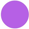 This colour combines the stability of blue and the energy of red it symbolizes power, nobility, luxury, and ambition conveying wealth and extravagance. Purple is associated with royalty, wisdom, dignity, independence, creativity, mystery, and magic. According to surveys, almost 75 percent of children prefer purple to all other colours. Light purple is a good choice for designs aimed at the females whilst bright purple is ideal for promoting children's products.
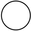 White means safety, purity, innocence and cleanliness. As opposed to black, white usually has a positive connotation. White can represent a successful beginning. Use white within your design to suggest simplicity. White is a popular colour choice for charitable organizations, hospitals and medical equipment.
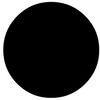
Associated with power, elegance, formality, death, and mystery. This mysterious colour is associated with strength, authority as well as fear. It is also considered to be a very formal, elegant, and prestigious colour (black tie). Black gives the feeling of perspective and depth, but a black background diminishes readability. Black contrasts well with bright colours. Combined with red or orange black creates an aggressive colour scheme.